Skip to collection list
Skip to video grid
SAS Visual Analytics
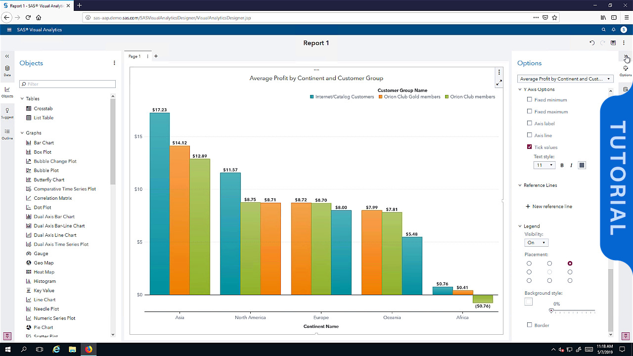
Creating Visualizations: Creating a Correlation Matrix and a Forecast and Perform Scenario Analysis
This video shows you how to compare data measures in SAS Visual Analytics Explorer by creating a correlation matrix and then creating a forecast in a line chart visualization to predict future values. You also learn how to perform scenario analysis.
Read More
Read Less
categories
View more in
Currently loaded videos are 1 through 15 of 44 total videos.
First page loaded, no previous page available
Load Next Page
Sort By:
Sort By:
Most Recent